#css button border animation
Explore tagged Tumblr posts
Visit Tumblr Blog
Explore Tumblr blogs with no restrictions, modern design and the best experience.
Last Seen Tumblr Blogs


Fun Fact
Forty percent of Tumblr users are between the ages of 18 to 25.
Text

CSS Button Animation
#css button border animation#css buttons#codenewbies#html css#html5 css3#frontenddevelopment#css#css animation examples#pure css animation#css animation tutorial#code#css tricks#css snippets#html5#frontend
3 notes
·
View notes
Text
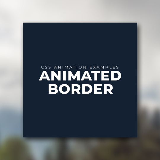
CSS Button Border animation
#css button border animation#css animation#css animation examples#css buttons#html css buttons#learn to code#html css#divinectorweb#frontenddevelopment#css3#css#code#html
1 note
·
View note
Text
The Lost CSS Tricks of Cohost.org
New Post has been published on https://thedigitalinsider.com/the-lost-css-tricks-of-cohost-org/
The Lost CSS Tricks of Cohost.org
You would be forgiven if you’ve never heard of Cohost.org. The bespoke, Tumblr-like social media website came and went in a flash. Going public in June 2022 with invite-only registrations, Cohost’s peach and maroon landing page promised that it would be “posting, but better.” Just over two years later, in September 2024, the site announced its shutdown, its creators citing burnout and funding problems. Today, its servers are gone for good. Any link to cohost.org redirects to the Wayback Machine’s slow but comprehensive archive.
The landing page for Cohost.org, featuring our beloved eggbug.
Despite its short lifetime, I am confident in saying that Cohost delivered on its promise. This is in no small part due to its user base, consisting mostly of niche internet creatives and their friends — many of whom already considered “posting” to be an art form. These users were attracted to Cohost’s opinionated, anti-capitalist design that set it apart from the mainstream alternatives. The site was free of advertisements and follower counts, all feeds were purely chronological, and the posting interface even supported a subset of HTML.
It was this latter feature that conjured a community of its own. For security reasons, any post using HTML was passed through a sanitizer to remove any malicious or malformed elements. But unlike most websites, Cohost’s sanitizer was remarkably permissive. The vast majority of tags and attributes were allowed — most notably inline CSS styles on arbitrary elements.
Users didn’t take long to grasp the creative opportunities lurking within Cohost’s unassuming “new post” modal. Within 48 hours of going public, the fledgling community had figured out how to post poetry using the <details> tag, port the Apple homepage from 1999, and reimplement a quick-time WarioWare game. We called posts like these “CSS Crimes,” and the people who made them “CSS Criminals.” Without even intending to, the developers of Cohost had created an environment for a CSS community to thrive.
In this post, I’ll show you a few of the hacks we found while trying to push the limits of Cohost’s HTML support. Use these if you dare, lest you too get labelled a CSS criminal.
Width-hacking
Many of the CSS crimes of Cohost were powered by a technique that user @corncycle dubbed “width-hacking.” Using a combination of the <details> element and the CSS calc() function, we can get some pretty wild functionality: combination locks, tile matching games, Zelda-style top-down movement, the list goes on.
If you’ve been around the CSS world for a while, there’s a good chance you’ve been exposed to the old checkbox hack. By combining a checkbox, a label, and creative use of CSS selectors, you can use the toggle functionality of the checkbox to implement all sorts of things. Tabbed areas, push toggles, dropdown menus, etc.
However, because this hack requires CSS selectors, that meant we couldn’t use it on Cohost — remember, we only had inline styles. Instead, we used the relatively new elements <details> and <summary>. These elements provide the same visibility-toggling logic, but now directly in HTML. No weird CSS needed.
These elements work like so: All children of the <details> element are hidden by default, except for the <summary> element. When the summary is clicked, it “opens” the parent details element, causing its children to become visible.
We can add all sorts of styles to these elements to make this example more interesting. Below, I have styled the constituent elements to create the effect of a button that lights up when you click on it.
This is achieved by giving the <summary> element a fixed position and size, a grey background color, and an outset border to make it look like a button. When it’s clicked, a sibling <div> is revealed that covers the <summary> with its own red background and border. Normally, this <div> would block further click events, but I’ve given it the declaration pointer-events: none. Now all clicks pass right on through to the <summary> element underneath, allowing you to turn the button back off.
This is all pretty nifty, but it’s ultimately the same logic as before: something is toggled either on or off. These are only two states. If we want to make games and other gizmos, we might want to represent hundreds to thousands of states.
Width-hacking gives us exactly that. Consider the following example:
In this example, three <details> elements live together in an inline-flex container. Because all the <summary> elements are absolutely-positioned, the width of their respective <details> elements are all zero when they’re closed.
Now, each of these three <details> has a small <div> inside. The first has a child with a width of 1px, the second a child with a width of 2px, and the third a width of 4px. When a <details> element is opened, it reveals its hidden <div>, causing its own width to increase. This increases the width of the inline-flex container. Because the width of the container is the sum of its children, this means its width directly corresponds to the specific <details> elements that are open.
For example, if just the first and third <details> are open, the inline-flex container will have the width 1px + 4px = 5px. Conversely, if the inline-flex container is 2px wide, we can infer that the only open <details> element is the second one. With this trick, we’ve managed to encode all eight states of the three <details> into the width of the container element.
This is pretty cool. Maybe we could use this as an element of some kind of puzzle game? We could show a secret message if the right combination of buttons is checked. But how do we do that? How do we only show the secret message for a specific width of that container div?
In the preceding CodePen, I’ve added a secret message as two nested divs. Currently, this message is always visible — complete with a TODO reminding us to implement the logic to hide it unless the correct combination is set.
You may wonder why we’re using two nested divs for such a simple message. This is because we’ll be hiding the message using a peculiar method: We will make the width of the parent div.secret be zero. Because the overflow: hidden property is used, the child div.message will be clipped, and thus invisible.
Now we’re ready to implement our secret message logic. Thanks to the fact that percentage sizes are relative to the parent, we can use 100% as a stand-in for the parent’s width. We can then construct a complicated CSS calc() formula that is 350px if the container div is our target size, and 0px otherwise. With that, our secret message will be visible only when the center button is active and the others are inactive. Give it a try!
This complicated calc() function that’s controlling the secret div’s width has the following graph:
You can see that it’s a piecewise linear curve, constructed from multiple pieces using min/max. These pieces are placed in just the right spots so that the function maxes out when the container div is 2px— which we’ve established is precisely when only the second button is active.
A surprising variety of games can be implemented using variations on this technique. Here is a tower of Hanoi game I had made that uses both width and height to track the game’s state.
SVG animation
So far, we’ve seen some basic functionality for implementing a game. But what if we want our games to look good? What if we want to add ✨animations?✨ Believe it or not, this is actually possible entirely within inline CSS using the power of SVG.
SVG (Scalable Vector Graphics) is an XML-based image format for storing vector images. It enjoys broad support on the web — you can use it in <img> elements or as the URL of a background-image property, among other things.
Like HTML, an SVG file is a collection of elements. For SVG, these elements are things like <rect>, <circle>, and <text>, to name a few. These elements can have all sorts of properties defined, such as fill color, stroke width, and font family.
A lesser-known feature of SVG is that it can contain <style> blocks for configuring the properties of these elements. In the example below, an SVG is used as the background for a div. Inside that SVG is a <style> block that sets the fillcolor of its <circle> to red.
An even lesser-known feature of SVG is that its styles can use media queries. The size used by those queries is the size of the div it is a background of.
In the following example, we have a resizable <div> with an SVG background. Inside this SVG is a media query which will change the fill color of its <circle> to blue when the width exceeds 100px. Grab the resize handle in its bottom right corner and drag until the circle turns blue.
Because resize handles don’t quite work on mobile, unfortunately, this and the next couple of CodePens are best experienced on desktop.
This is an extremely powerful technique. By mixing it with width-hacking, we could encode the state of a game or gizmo in the width of an SVG background image. This SVG can then show or hide specific elements depending on the corresponding game state via media queries.
But I promised you animations. So, how is that done? Turns out you can use CSS animations within SVGs. By using the CSS transition property, we can make the color of our circle smoothly transition from red to blue.
Amazing! But before you try this yourself, be sure to look at the source code carefully. You’ll notice that I’ve had to add a 1×1px, off-screen element with the ID #hack. This element has a very simple (and nearly unnoticeable) continuous animation applied. A “dummy animation” like this is necessary to get around some web browsers’ buggy detection of SVG animation. Without that hack, our transition property wouldn’t work consistently.
For the fun of it, let’s combine this tech with our previous secret message example. Instead of toggling the secret message’s width between the values of 0px and 350px, I’ve adjusted the calc formula so that the secret message div is normally 350px, and becomes 351px if the right combination is set.
Instead of HTML/CSS, the secret message is now just an SVG background with a <text> element that says “secret message.” Using media queries, we change the transform scale of this <text> to be zero unless the div is 351px. With the transition property applied, we get a smooth transition between these two states.
Click the center button to activate the secret message:
The first cohost user to discover the use of media queries within SVG backgrounds was @ticky for this post. I don’t recall who figured out they could animate, but I used the tech quite extensively for this quiz that tells you what kind of soil you’d like if you were a worm.
Wrapping up
And that’s will be all for now. There are a number of techniques I haven’t touched on — namely the fun antics one can get up to with the resize property. If you’d like to explore the world of CSS crimes further, I’d recommend this great linkdump by YellowAfterlife, or this video retrospective by rebane2001.
It will always hurt to describe Cohost in the past tense. It truly was a magical place, and I don’t think I’ll be able to properly convey what it was like to be there at its peak. The best I can do is share the hacks we came up with: the lost CSS tricks we invented while “posting, but better.”
#2022#2024#ADD#advertisements#amazing#animation#animations#apple#Art#Articles#attributes#background#background-image#Blue#border#burnout#buttons#change#checkbox hack#Children#code#Color#Community#comprehensive#container#continuous#creators#CSS#css animations#css-tricks
0 notes
Text

CSS Landscape | 2024 #2 Welcome to CSS Landscape digest, where we curate the latest articles, tutorials, and videos to keep you informed and inspired in the world of CSS. In this edition, discover techniques for breaking words effectively, explore innovative CSS button styles, and learn how to handle dark mode with CSS and JavaScript. Dive into advanced tooltip design, captivating border animations, and much more. Stay ahead in CSS trends and techniques with CSS Landscape digest. https://freefrontend.com/css-landscape-2024-03-29/
2 notes
·
View notes
Text
Web Development Training Program
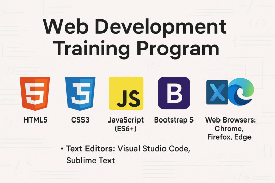
Master the Core Front-End Technologies: HTML, CSS, JavaScript, and BootstrapThis course provides a complete introduction to front-end web development, enabling you to build responsive, interactive, and professional websites from scratch. By mastering these technologies, you'll be equipped with the foundational skills needed for a career in web development.Tools & Technologies Covered:HTML5 CSS3 JavaScript (ES6+) Bootstrap 5 Text Editors: Visual Studio Code, Sublime Text Web Browsers: Chrome, Firefox, Edge Understand how websites are structured and styled using HTML and CSS. Create interactive, dynamic web pages using JavaScript. Build responsive, mobile-first web designs using Bootstrap. Overview of the Web Development Process Understanding Client-Side and Server-Side Development Setting Up the Development Environment (Text Editors, Browsers) Structure of an HTML Document Basic HTML ElementsHeadings, Paragraphs, Lists, Links Images and Media ElementsAdding Images, Audio, and Video Forms and Input ElementsText Fields, Buttons, Dropdowns, and Checkboxes Semantic HTML5 Tags (header, nav, section, article, footer) CSS Syntax: Selectors, Properties, and Values Styling Text and ElementsFonts, Colors, Backgrounds, Borders The Box Model (Margins, Padding, Borders, Content) Layout and PositioningStatic, Relative, Absolute, Fixed, and Sticky Responsive Design with Media Queries Advanced Features: Animations, Transitions, Gradients Introduction to JavaScript Variables and Data Types (var, let, const) Operators and Control Flow (if-else, loops) Functions and EventsWriting and Calling Functions Handling Click, Mouse, and Keyboard Events Arrays and Objects Manipulating the DOMSelecting and Updating HTML Elements Adding Dynamic Behavior to Web Pages Setting Up Bootstrap (CDN or Local) Understanding the Grid SystemRows, Columns, Breakpoints for Responsive Layouts Using Bootstrap ComponentsNavigation Bars, Modals, Buttons, Cards, Forms Styling with UtilitiesColors, Spacing, Typography Advanced FeaturesCreating Hero Sections and Interactive Forms Customizing Bootstrap with Custom CSS and Sass Combining All Technologies to Create Web Pages Styling and Adding Interactivity to Content Building Responsive and Dynamic Multi-Page Websites Developing a Full-Stack Web ApplicationResponsive Landing Page with Navigation Interactive Elements (Forms, Buttons, Modals) Using JavaScript for Dynamic Content and Validations Styling the Project with Bootstrap Components Hands-On Practice: Build multiple projects throughout the course. Real-World Application: Work on a capstone project to create a complete website. Certification: Earn a Web Development certificate upon successful completion. Aspiring web developers and designers. Students looking to start a career in front-end development. Professionals seeking to build personal or business websites. Read the full article
0 notes
Text
How to Create a Custom Scrollbar Using CSS & JavaScript
A scrollbar might seem like a small detail, but customizing it can add a unique touch to your website’s design. While most sites stick with default browser scrollbars, a personalized version can align better with your brand or improve user experience. Let’s walk through how to build one using CSS and JavaScript—no fancy tools required!
Why Customize Scrollbars?
Default scrollbars work fine, but they don’t always match a site’s style. Custom scrollbars let you:
Match your site’s color scheme.
Adjust thickness for better visibility.
Add smooth animations or hover effects.
Plus, it’s a fun way to surprise visitors with subtle creativity.
Step 1: Styling the Scrollbar with CSS
CSS handles the visual part of the scrollbar. Here’s how to style it:
For WebKit Browsers (Chrome, Safari, Edge)
Browsers like Chrome use WebKit, which supports special CSS pseudo-elements for scrollbars:
css
Copy
/* The entire scrollbar area */
::-webkit-scrollbar {
width: 12px; /* Adjust thickness */
}
/* The draggable part */
::-webkit-scrollbar-thumb {
�� background: #4CAF50; /* Color of the scrollbar */
border-radius: 8px; /* Rounded edges */
}
/* The track (background) */
::-webkit-scrollbar-track {
background: #f1f1f1; /* Track color */
}
/* Hover effects */
::-webkit-scrollbar-thumb:hover {
background: #45a049;
}
For Firefox
Firefox uses simpler CSS properties:
css
Copy
html {
scrollbar-width: thin; /* "auto" or "thin" */
scrollbar-color: #4CAF50 #f1f1f1; /* thumb and track colors */
}
Note: Firefox doesn’t support rounded corners or hover effects yet, so keep designs simple for cross-browser consistency.
Step 2: Adding Interactivity with JavaScript
JavaScript lets you add dynamic behavior, like changing the scrollbar on click or animating it. Here are two examples:
Example 1: Changing Scrollbar Color on Click
Let users toggle between light/dark modes:
html
Copy
<button onclick="toggleTheme()">Toggle Theme</button>
Run HTML
javascript
Copy
function toggleTheme() {
const body = document.body;
body.classList.toggle('dark-mode');
// Update scrollbar colors
if (body.classList.contains('dark-mode')) {
document.documentElement.style.setProperty('--scroll-thumb', '#333');
document.documentElement.style.setProperty('--scroll-track', '#111');
} else {
document.documentElement.style.setProperty('--scroll-thumb', '#4CAF50');
document.documentElement.style.setProperty('--scroll-track', '#f1f1f1');
}
}
Update your CSS to use variables:
css
Copy
:root {
--scroll-thumb: #4CAF50;
--scroll-track: #f1f1f1;
}
::-webkit-scrollbar-thumb {
background: var(--scroll-thumb);
}
::-webkit-scrollbar-track {
background: var(--scroll-track);
}
html {
scrollbar-color: var(--scroll-thumb) var(--scroll-track);
}
Example 2: Smooth Scrolling
Make scrolling feel smoother:
javascript
Copy
document.querySelectorAll('a[href^="#"]').forEach(anchor => {
anchor.addEventListener('click', function(e) {
e.preventDefault();
const target = document.querySelector(this.getAttribute('href'));
target.scrollIntoView({ behavior: 'smooth' });
});
});
Step 3: Testing Across Browsers
Not all browsers support custom scrollbars the same way. Here’s how to handle it:
WebKit (Chrome/Safari/Edge): Full styling options.
Firefox: Limited to color and thickness.
Internet Explorer: No support—stick to defaults.
Always test your design in multiple browsers to avoid surprises.
Common Pitfalls & Fixes
Scrollbar Overlaps Content Fix: Add padding to the right of your content:
css
Copy
body {
padding-right: 12px; /* Match scrollbar width */
}
Mobile Compatibility Mobile browsers often hide scrollbars. Focus on desktop styling unless you’re using JavaScript-based scrollbars.
Performance Issues Avoid heavy animations on the scrollbar—they can slow down older devices.
When to Ask for Help
If coding this feels overwhelming, a website designing company in India can handle the technical bits while you focus on your site’s goals. They’re pros at balancing aesthetics and functionality.
Final Tips
Keep it simple: Don’t make scrollbars too flashy—they should help, not distract.
Use CSS variables: Makes updating colors easier later.
Test with real users: Get feedback to ensure your scrollbar feels natural.
Custom scrollbars are a small detail with big impact. Whether you code it yourself or partner with a website designing company in India, this tweak can make your site feel polished and cohesive.
#best web development agencies india#website design and development company in india#website development company in india#web design company india#website designing company in india#performance marketing services in Bhubaneswar
0 notes
Text
Lightboxes
YAYINDA! https://mguzel.com.tr/lightboxes/
Lightboxes
Lightboxes Shortcodes
The lightboxes are driven by Visual Composer Single Image shortcodes.
Single Image
Simple popups with different styles.
DEFAULT
DEFAULT WITH BORDER
WITH ICON
HOVER EFFECT
Simple Image Gallery
Image gallery in the same row.
Zoom Image Gallery
Image gallery in the same row.
Zoom Image Gallery + Carousel
Dialog with CSS animation
Animations are added with simple CSS transitions, you can make them look however you wish.
Open with fade-zoom animation
Dialog example
This is dummy copy. It is not meant to be read. It has been placed here solely to demonstrate the look and feel of finished, typeset text. Only for show. He who searches for meaning here will be sorely disappointed.
Open with fade-slide animation
Dialog example
This is dummy copy. It is not meant to be read. It has been placed here solely to demonstrate the look and feel of finished, typeset text. Only for show. He who searches for meaning here will be sorely disappointed.
Popup with video or map
In this example lightboxes are automatically disabled on small screen size and default behavior of link is triggered.
Open YouTube Video
Open Vimeo Video
Open Google Map
Open YouTube Video
Open Vimeo Video
Open Google Map
Ajax
You have full control of what is displayed in popup, align it to any side via CSS, enable or disable scroll on right side of window.
Load Ajax Content
Form
Entered data is not lost if you open and close the popup or if you go to another page and then press back browser button.
Open Form
Hata: İletişim formu bulunamadı.
0 notes
Text
Integrating Animations in Slot Machines Using HTML and CSS

Animations are a crucial part of modern slot machine games. They add visual appeal to the game and make it more interesting for players. Using slot machine HTML code along with CSS, developers can create dynamic effects that captivate users and elevate gameplay. Whether it is spinning reels, celebratory animations, or flashing lights, animations can turn a simple slot game into an immersive experience.
In this article, we’ll explore how to effectively integrate animations into your slot machine games using HTML and CSS. Additionally, we’ll discuss best practices, common challenges, and tips to ensure your animations work seamlessly across different devices.
Why Use Animations in Slot Machines?
Animations are the lifeblood of the gaming industry, especially slot machines. They bring life to the interface and make gameplay more exciting and enjoyable. Here are a few reasons why animations are important:
Enhanced User Engagement
Animations attract attention and make the user feel rewarded during critical moments, such as winning a jackpot.
Improved Visual Appeal
The right animation design elevates the overall aesthetic of the game.
Seamless Transitions
Animations help in creating smoother transitions between game states, such as spinning and stopping reels.
By using slot game HTML code, developers can easily achieve these effects.
Basics of Animation in HTML and CSS
Before getting into implementation, it is important to understand how HTML and CSS contribute to slot machine animations:
HTML:
Acts as the structural backbone of the slot machine, defining the layout and elements like reels, buttons, and indicators.
CSS:
Adds style effects and animations, utilizing the properties @keyframes, transition, and transform.
Key HTML Elements to Design Slot Machine Animations
Developers first begin by using slot machine HTML code to set up the initial layout of the game. A few common elements used include:
Reels:
Represented with <div> elements or a grid layout.
Buttons:
Activate the spinning of reels, starting or stopping them.
Indicators:
Show wins or active paylines.
CSS Animation Properties You Need to Know
There are several tools for adding animations using CSS:
@keyframes:
Defines the step-by-step behavior of an animation.
transition:
Smoothens the transition between property changes.
transform:
Allows rotation, scaling, and movement of elements.
You can combine all these to make your slot machine games visually appealing and functional. Here's how you can add animations in slot machine HTML code step by step.
Step 1: Structuring the Slot Machine with HTML
First, develop a slot machine structure using slot machine HTML code. This entails the definition of reels, buttons, and other significant components.
Step 2: Applying CSS Styling to Enhance the Look
Afterward, add the styles to enhance the look and feel. These include the setup of the background, reel borders, and button designs to align with the game's theme.
Step 3: Adding Reel Spin Animations
To animate the reels, use CSS animations. For instance, @keyframes can define the spinning motion, while transform can rotate or translate elements to mimic realistic spins.
Step 4: Adding Winning Animations
Winning animations, such as flashing lights or celebratory effects, can be triggered when the player hits a winning combination. CSS properties like opacity and scale can create dynamic effects.
Testing and Debugging Slot Machine Animations
Testing is an important step to ensure that your animations are working properly on different devices and browsers. Here are some tips:
Cross-Browser Compatibility:
Test your animations on the most popular browsers to avoid inconsistencies.
Performance Optimization:
Use lightweight CSS techniques to avoid lag, especially on mobile devices.
Debugging Tools:
Utilize browser developer tools to inspect and fine-tune your animations.
These steps will ensure that your slot machine HTML code delivers a smooth and enjoyable user experience.
Best Practices for Slot Machine Animations
To make your animations effective and user-friendly, follow these best practices:
Keep It Simple:
Avoid overly complex animations that may distract from gameplay.
Focus on Key Interactions:
Highlight significant events, such as wins or bonuses.
Optimize for Mobile:
Use responsive design techniques to ensure animations adapt to various screen sizes.
Test Thoroughly:
Regular testing helps identify and fix potential issues before deployment.
Conclusion
Using animations on slot machines by slot machine HTML code and CSS can greatly improve the user experience. From spinning reels to celebratory effects, animations bring excitement and engagement to your games. You can create stunningly beautiful and highly functional slot games by knowing the basics, following best practices, and testing thoroughly.
If you are looking for professional help in creating slot games, contact AIS Technolabs. Since we have hands-on experience designing interactive and responsive slot machine games, we could bring your visions to life with our help. Contact us to know more.
FAQ
Q1: Can I utilize JavaScript for animation in slot machines alongside HTML and CSS?
Yes, JavaScript will add interactivity and dynamic behaviors to elements defined in your slot machine HTML code and styled with CSS to enhance animations.
Q2: How can I optimize slot machine animations for mobile devices?
Use responsive design techniques in your slot machine HTML code and CSS. For example, you could make use of media queries and flexible layouts so that animations are not affected across different devices.
Q3: What are some common problems with slot machine animations, and how can I solve them?
Common problems include lag animations, cross-browser inconsistencies, and unresponsive designs. Regular testing and optimizing your slot game HTML code can help resolve these problems.
Blog Source: https://www.knockinglive.com/integrating-animations-in-slot-machines-using-html-and-css/?snax_post_submission=success
0 notes
Text
Ao3 HTML/Coding References-Part I
I recently made a code-heavy choose your own adventure fic, and I wanted to compile all of the really helpful resources I've found along the way. Basics, Text altering and Fancy Formatting (adding dividers, columns, photos, videos, tabs etc.) is below!
(Note: I've had to split this in two, so see Part II for all the website mimic HTML)
Basics:
This Ao3 Posting Doc converts Google doc into HTML, adding bold, underline, italics, strikethrough, paragraph breaks, and centered text. Major game changer for heavy HTML works
The Fic Writer's Guide to Formatting by AnisaAnisa: This is a masterpost in itself, covering links, images, boxes, borders, fonts etc. So I'm putting it here since it's amazingly helpful
HTML References by W3 schools- I've linked the HTML colors here, but this is a platform designed to help people learn/reference HTML
Ao3's own guide to HTML on their site Lovely Q&A for Ao3 specific HTML questions
A Guide to Ao3 HTML by Anima Nightmate (faithhope) This walks through what HTML code means SO WELL!
Text resources: (altering the color, font, emoji, style etc.)
Font's chapter: The Fic Writer's Guide to Formatting: okay I know I already linked it above, but listen it's very good so I'm linking again
Fonts colors and work skins oh my by Charles_Rockafeller takes fonts to a different level.
Multicolored text skin by ElectricAlice GRADIENT TEXT
All the Emoji by CodenameCarrot while Ao3 has signifigantly improved on hosting emojis, this code helps with using some more unconventional emojis. Amazing resource.
Upsidedown text and Zalgo text generators - these specific text generators allow for you to see their direct HTML codes
Fun CSS Text Effects by DoctorDizzyspinner
Workskin for showing and hiding spoilers by ElectricAlice makes text appear when hovered/clicked. Amazing for Trigger Warnings
Make text appear when you click [Work skin] by Khashana clickable end notes buttons for your work, similar to the spoiler button text
Hide spoilers like Discord by Professor_Rye
Desktop/mobile friendly short tooltips workskin by Simbaline
How to make Linked Footnotes on Ao3 by La_Temperanza
User-selectable Names in a Fanfic work by fiend Ever want people to select between different names in a fanfic? I could also see this used as ability to switch gender in a fanfic.
AO3 Comic Text Effects using CSS by DemigodofAgni Ever want a giant comicbook POW in your fic?
How to override the Archive's Chapter Headers by C Ryan Smith
Collection: CSS Guides by Goddess_of_the_arena (many helpful text walkthrough resources)
Fancy Formatting {Note: this got long so I split it up into more manageable sections}
Coding Masterpieces (Multiple things within the same fic)
Personal Experiment with HTML and CSS by MohnblumenKind This has a variety of help, Chapter 6 & 7 were great for choose your own adventure, Chapter 4 talks about columns and skins, and Chapter 10 even has a newspaper made entirely from site code.
Repository by gaudersan google searches, ao3 stats, instagram and text messages galore
CSS in Testing/Bleed Gold by InfinitysWraith Masterclass in cool formatting, including overidding default headers, Doors opening animation, Grid interactive photos, Hovering to change a photo, Retroactive text etc.
CSS in Testing:Second in Series by InfinitysWraith: Interactive keypads, Mock news site and interactive locking mechanism.
Coding Encyclopedia by Anonymous: chess, opening html envelopes, functioning clocks, HTML Art– this book is genuinely the most advanced stuff I’ve seen with HTML code on Ao3– and I’ve looked at every guide on this list.
Decorations (Boxes, Dividers, letters/background)
How to mimic letters, fliers and stationary without using images by La_Temperanza Really helped with box formatting
Decorations for Fic (HTML/CSS): Fanart, Dividers, Embedded Songs and More by Jnsn this has SO MANY cool coding features, including a chessboard that moves when you hover over it
Build a divider tool demo by skinforthesoul
How to make custom Page Dividers by La_Temperanza
Found Document work skin by hangingfire
Embedding other formats: (Images, gifs, youtube videos, audio, alt text)
Embed that Audio by Azdaema
Newbies guide to Podficcing by Azdaema
Embedding youtube videos on ao3 to scale with the screen by pigalle add youtube videos mid fic
Conlangs and Accessibility by Addleton this fic instructs how to have accessible translations in fic
How to make Images Fit on Mobile Browsers by La_Temperanza great image adding code
How to Wrap text around images by La_Temperanza image text wrapping
How to put pictures and gifs on Ao3 from Google Drive by gally_hin
Choose Your Own Adventure Code
How to make a Choose Your Own Adventure Fic by La_Temperanza allows for clickable links and hidden text.
Interactive fiction Workskin Tutorial by RedstoneBug BEST CHOOSE YOUR OWN ADVENTURE RESOURCE
How to make your fic look like the game by MelsShenanigans, ThoughtsCascade (I was a Teenage Exocolonist is the game but it’s a Choose your own adventure re-skin)
Newspaper/Article/Blog mimic
How to make a News Website Article Skin on Ao3 by ElectricAlice
Newspaper/Magazine Article Template by deathbymistletoe
Newspaper Article by lordvoldemortsskin --basic but adaptive for mobile
Newspaper Article Adaptation by KorruptBrekker modification for different columns
TMZ WorkSkin by Anonymous
Basic blogpost skin by Anonymous
Blog Post Work Skin by Anonymous
Journaling App by egnimalea
Email Mimic
How to insert Gmail emails in your fic by DemigodofAgni
How to mimic Email Windows by La_Temperanza
Gmail Email Skin by Sunsetcurbed
The idiot’s incoherent guide for learning css & html for ao3 in dystopia by anonymous (Gmail skin)
Search Engine Mimic
Google Search Suggestions Work Skin and Tutorial by Bookkeep
Baidu Search History Work Skin by Bookkeep
Repository by gaudersan
Misc. General formats with HTML (mission reports, spreadsheets, other documents)
Screenplay skin by astronought
Screenplay workskin by legonerd
Mock Spotify Playlist WorkSkin by Anonymous
How to make a rounded playlist by La_Temperanza Ever want to show a character's music playlist within your fic
Workskin for in Universe Investigative/Mission Report with Redaction by wafflelate case files/CSI reports
Learn to Microsoft Excel by ssc_lmth insert a spreadsheet in your fic
Ao3 Work skin: a simple scoreboard by revanchist shows how to code a scoreboard
Colossal Cave Adventure by gifbot Working Keyboard anyone?
Tabbing experiment by gifbot (clickable tabs)
Bonus: Ever wanted to see how crazy HTML can be on AO3? Try playing But can it run Doom? or Tropémon by gifbot
Happy Creating!
Last updated: Dec 28 2024 (Have a resource that you want to share? My inbox is open!)
See Part II for Website Mimics here!!
#html coding#archive of our own#ao3 fanfic#fanfic#fanfiction#ao3 writer#ao3#ao3 author#fanfic writing#fanfic authors#fanfic ideas#ao3fic#fanfics#archive of my own#fanfic help#fanfic coding
972 notes
·
View notes
Text
Best Press Component Manufacturing Service in Hosur - TSK
Understanding the Press Component: A Fundamental Element in Web Development
In the realm of modern web development, interactivity plays a crucial role in crafting engaging user experiences. One of the core elements that allow users to interact with websites and applications is the Press component. From submitting forms to navigating between pages, the Press component—often represented by buttons or clickable elements—forms the backbone of user interaction on the web. This blog will explore the fundamental aspects of the Press component, its importance, and how developers can implement it effectively.
What is a Press Component?
The Press component refers to an interactive element within a website or application that responds to user input, typically in the form of a click or tap. Most commonly, this takes the shape of a button, link, or other clickable areas that, when pressed, trigger an event or action on the website. Examples include submitting a form, triggering a modal popup, navigating to a new page, or changing content dynamically.
While simple in concept, the Press component is a vital part of the web's interactive experience. Without it, websites would be static and unresponsive, hindering user engagement.
Why is the Press Component Important?
User Interaction: At its core, the Press component facilitates user interaction, allowing visitors to perform actions on a webpage. Whether it's clicking a "Submit" button, pressing a "Next" link, or toggling between different sections of content, these interactive elements are central to how users navigate and engage with digital content.
Feedback and Usability: A critical aspect of the Press component is the feedback it provides. Users need to know that their actions have been acknowledged. Visual feedback, like changes in button color, text changes, or animations, assures users that their input was successful. This immediate feedback not only improves usability but also contributes to a positive user experience.
Mobile Responsiveness: With the rise of mobile web browsing, ensuring that Press components are optimized for touchscreen interactions is essential. Press components must be large enough to be easily tappable on small screens, and they should offer smooth responses to touch gestures. Mobile-friendly design is no longer optional but a necessity.
Accessibility: An often overlooked yet crucial benefit of the Press component is its role in web accessibility. Properly designed Press components with clear labels, focus states, and support for keyboard navigation ensure that users with disabilities can interact with a website effectively.
How to Implement a Press Component
Basic HTML and CSS
The most fundamental way to create a Press component is through simple HTML and CSS. For example, a basic button can be created using the <button> tag:
<button>Click Me</button>
By adding some CSS, you can make the button more interactive:
button {
padding: 10px 20px;
background-color: blue;
color: white;
border: none;
cursor: pointer;
}
button:hover {
background-color: darkblue;
}
In this example, the button changes color when hovered over, providing visual feedback to the user.
Adding JavaScript for Interactivity
To enhance the Press component further, JavaScript is often used to add functionality. For example, you can use JavaScript to trigger an action when the button is clicked, such as showing an alert or changing the content on the page:
<button onclick="alert('Button Pressed!')">Press Me</button>
In this case, when the user clicks the button, an alert box will appear on the screen, confirming that the press action was successful.
Advanced Implementation with Frameworks
For more complex applications, many developers turn to JavaScript frameworks like React, Vue, or Angular. These frameworks offer more powerful ways to manage user interactions and state changes within the application.
For example, in React, a Press component might look like this:
import React, { useState } from 'react';
function PressButton() {
const [pressed, setPressed] = useState(false);
const handlePress = () => setPressed(!pressed);
return (
<button onClick={handlePress} style={{ backgroundColor: pressed ? 'green' : 'blue' }}>
{pressed ? 'Pressed' : 'Press Me'}
</button>
);
}
Here, the button changes color based on its state (pressed or not), making the interaction even more dynamic and engaging.
Best Practices for Press Components
Clear Labeling: Buttons and other pressable elements should have clear, descriptive labels that indicate their function. For example, use labels like "Submit," "Next," or "Learn More" rather than ambiguous terms.
Visual Feedback: Always provide visual feedback when a Press component is activated. This could be a color change, a shadow effect, or a subtle animation.
Mobile Optimization: Ensure that Press components are large enough for mobile users to interact with easily. Make buttons and links easily tappable, with enough spacing to prevent accidental clicks.
Keyboard Accessibility: Make sure interactive components are accessible via keyboard. Buttons should be focusable and activated using the Enter or Space keys, providing an inclusive experience for all users.
Conclusion
The Press component is a fundamental part of the web development toolkit. It empowers users to interact with websites and applications, triggering actions and events that shape the user experience. By understanding its importance and implementing it with care—through clear labeling, visual feedback, and accessibility considerations—developers can create seamless, engaging, and user-friendly digital experiences. Whether it's a simple button or a complex interactive element, mastering the Press component is key to building modern, functional, and responsive websites.
0 notes
Text
Exception WordPress Theme - Responsive Multi-Purpose Theme
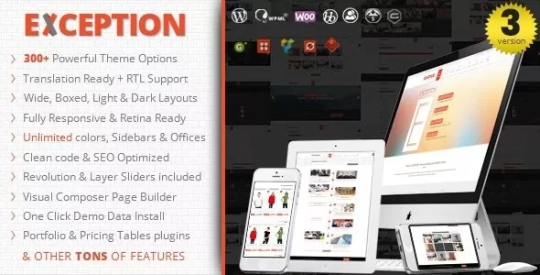
The Exception WordPress Theme is an amazing theme that will dazzle your site visitors and make their experience on your site enjoyable and memorable. LIVE PREVIEWBUY FOR $59


The Exception WordPress Theme is a Responsive Multi-Purpose WordPress Theme built using HTML5/CSS3 features and suitable for creative companies, agencies, and freelancers which need a professional way to showcase their projects, services, and sell their products. EXCEPTION is fully responsive and retina ready so it works nicely on Smartphones, tablet PCs, and desktops. We built EXCEPTION with the latest Bootstrap responsive framework because we want our customers would find a light awesome, powerful, and easy-to-use theme. LIVE PREVIEWBUY FOR $59
Key Features
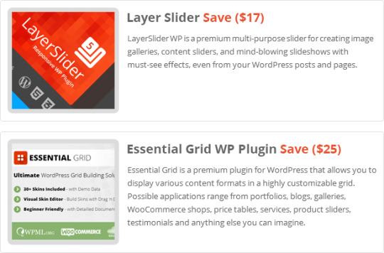
- Drag And Drop Page Builder Included Save($28). - Slider Revolution WordPress Plugin Included Save($18) - Layer Slider WordPress Plugin Included Save($17) - Essential Grid WordPress Plugin Included Save($25) - Go Responsive Pricing Tables WordPress Plugin Included Save($19) - Wide And Boxed Layouts - Light And Dark Skins. - Unlimited Color Skins with 12 Predefined Skin Colors. - 14 Different Home Pages. - 12 Menu Animation Effects. - 7 Different Header Styles & Customizable Sticky Navigation. - 4 Different Footer Styles With Unlimited Number of Widgets And Customizable Columns. - 4 Contact Us Page Styles. - 5 Blog Styles (Large Image, Small Image, Timeline, Masonry and Grid) + (Left, Right and No Sidebar). - 10 Different Customizable Page Titles (With CustomImage And Video Backgrounds). - 3 Pager Types(Numeric, Older-Newer and Load more with Ajax) - 6 Different pager Styles (Skewed, Gray Round, Diamond, Light Round, Bottom Border and Circle) - One Page Site. - Custom Widgets: - Twitter Widget. - Flickr Feed Widget. - Contact Info Widget. - Side Banners Widget. - Custom Recent Posts. - Footer Social Icons With Logo and Text. - One Click Install Demo Content. - WooCommerce Ready With Custom Sidebar And Custom 6 Pager Styles. - BBPress (Forums) Ready With Custom Welcome Message, Forum Thumbnail, Sidebar And Custom 6 Pager Styles. - BuddyPress Ready With Custom SideBar. - Easy Digital Downloads Ready With Custom Sidebar And Custom 6 Pager Styles. - Gravity Forms Support - Contact Form 7 Support - RTL support. - Coming Soon Page. - Custom Author’s page. - Parallax Backgrounds effect. - Custom Page Options (Very Powerful Options For Each Page Individually). - Mega Menu Support With 3 Different Styles. - Blog Post Social Share. - Dynamic Google Web Fonts Typography. - Custom 404 Page. - Powerful Shortcodes - 8 Heading Styles. - 10 Icon Boxes styles. - Carousel And Grid Testimonials Styles. - Carousel And Grid Clients Styles. - 4 Fun Staff Styles. - 2 Team Member Styles. - Custom Counter Animations differenr from the fun staff counters. - 10 Block Separators Styles (Dividers). - FontAwesome 479+ Icons - Cross Browser Compatible (IE9/10/11, Firefox, Chrome, Opera, Safari) - Pretty CSS3 Effects and Animation - Optimized and Clean Code - Optimized for better User Experience - Fully Customizable, step-by-step documentation included
Updates History
Version 3.3.0 ? Jan. 30, 2023 --- Update: PHP 8 Compatibility. --- Update: winsomethemes Shortcodes, Rev. Slider, WP Backery, Go Pricing and Essential Grid Plugins. --- Update: WordPress 6.x compatibility. --- Fix: Minor CSS & Responsive issues. Version 3.2.0 ? Jan. 12, 2021 --- Update: PHP 8 Compatibility. --- Update: Rev. Slider, WP Backery and Essential Grid Plugins. --- Update: WordPress 5.6 compatibility. Version 3.1.0 ? Aug. 22, 2020 --- Update: Rev. Slider, WP Backery and winsomethemes Shortcodes Plugins. --- Update: WordPress 5.5 compatibility. Version 3.0.0 ? December. 02, 2019 --- Added option to show / hide Back to top button. --- Added option to change site links color. --- Added option to change sidebar width. --- Added option for Horizontal / vertical site padding. --- Added option to choose Retina logo & Sticky header logo. --- Added option to change menu items spacing. --- Added option to change dropdown menu width. --- Added option to show / hide main menu items icons. --- Added option to show / hide sub menu items icons. --- Added option to change Read More text in Blog listing. --- Added option to show / hide “Post icon, post title, post category, date, author, etc…” in blog listing. --- Added option to show / hide “Post icon, post category, tags, date, author, etc…” in blog Single post. --- Added option to change max. Number of words instead of excerpt in blog listing. --- Added option to import / export theme options. --- Added option to show only menu item icon. --- Added login widget. --- Added Instagram widget. --- Added Shortcode widget. --- Added MailChimp newsletters widget. --- Added new option for each widget to use extra CSS class to apply custom styles for individual widget. --- Changed some font styles and this is for better typography and to be up-to-date with the new design trends. --- Update: WP Backery Page Builder Plugin. --- Update: Slider Revolugion Plugin. --- Update: winsomethemes Shortcodes Plugin. --- Update: Go Pricing Plugin. --- Update: Essential Grid Plugin. --- Update: WordPress 5.x Compatibility. --- Update: PHP 7.x Compatibility. --- Update: Woocommerce Compatibility. --- Enhancement: More Theme speed and code optimization. Version 2.3.0 ? June. 09, 2018 --- Updated Rev. Slider, Visual Composer, IT RAYS Shortcodes, LayerSlider and Ess. Grid Plugins to the latest versions. --- Updated Theme compatibility with latest WP version 4.9.x. --- Updated Theme compatibility with latest WooCommerce Plugin. Version 2.2.1 ? Aug. 20, 2017 --- Updated Rev. Slider, Visual Composer, IT RAYS Shortcodes, LayerSlider and Ess. Grid Plugins to the latest versions. --- Fixed Some minor compatibility errors with latest WP version 4.8.1.. Version 2.1.0 ? Feb. 23, 2017 --- Added: Option to Hide Page title from All pages. --- Added: Option to Show / Hide Page Loader. --- Added: 15 Page pre-loader styles. --- Update: Visual Composer, Revolution Slider, LayerSlider and Ess. Grid Plugins. --- Fix: Sidebar issue in Posts. --- Enhance: Top bar is now visible in responsive view. --- Enhance: Compatibility with WP 4.7.2 Version 2.0.5 ? Sep. 8, 2016 --- Updated Visual Composer and Revolution Slider Plugins. --- Updated Twitter Feeds widget to the latest version. --- Fixed some minor css conflict with theme options and admin dashboard. Version 2.0.3 ? April 23, 2016 --- Updated Visual Composer and Revolution Slider Plugins. Version 2.0.2 ? April 17, 2016 --- Updated Visual Composer , Layer Slider and Revolution Slider Plugins. --- Fixed Left and right header css issue on small devices. Version 2.0.1 ? March 5, 2016 --- Update: Changed Latest Tweets Widget to be Compatible With The Latest Twitter Code. --- Update : Slider Revolution Plugin to The Latest Version 5.2.1. --- Fix: Page Title Icon Issue. Version 2.0.0 ? March 2, 2016 --- New: Custom Pages Transitions. --- New: Custom Menu For Each Page. --- New: Changed Theme Options Design For More Usability. --- New: Coming Soon Full Functionality. --- New: Added Font Icons Libraries and Updated Existing One. --- Update: Custom Shortcodes Enhancements. --- Update: Major Performance Enhancements. --- Update: Search Page Functionality. --- Update: Theme to be Compatible with WooCommerce Latest Version. --- Update: Premium Plugins to The Latest Versions. --- Fix: Some Minor Issues. Version 1.5.4 ? December 21, 2015 --- Update: theme to be compatible with WP 4.4. --- Update: js_composer plugin to latest version. --- Update: revolution slider plugin to latest version. --- Update: Essential Grid plugin to latest version. Version 1.5.3 ? November 27, 2015 --- Changed Social Share jquery plugin. --- Update: js_composer plugin to latest version. --- Update: revolution slider plugin to latest version. Version 1.5.2 ? October 6, 2015 --- update: major security updates (XSS vulnerability) for Visual composer page builder plugin. Version 1.5.1 ? Sep. 23, 2015 --- Updated Visual Composer Plugin to the latest version. Version 1.5 ? Sep. 22, 2015 --- Added Left & Right Side Headers. --- Added login with email functionality to top login box. --- Enabled Front-end Editor in VC. --- Enhancement: Parallax Effect enhancements. --- Updated visual composer plugin to the latest version. --- Updated revolution slider plugin to the latest version. --- Updated Layer Slider plugin to the latest version. --- Updated essential grid plugin to the latest version. --- Fixed Shop Product variations issues. Version 1.4.3 ? June 27, 2015 --- prettyPhoto updated to 3.1.6 - latest stable and secure version. --- Updated visual composer plugin to the latest version. --- Updated revolution slider plugin to the latest version. --- Updated Layer Slider plugin to the latest version. --- Updated essential grid plugin to the latest version. Version 1.4.2 ? April 30, 2015 --- update: Visual Composer Page Builder To The Latest Version. --- update: Revolution Slider To The Latest Version. --- update: Essential Grid To The Latest Version. --- update: winsomethemes-shortcode Plugin compatibility with js_composer 4.5. --- fix: Portfolio Single Page compatibility with WP 4.2.1. --- fix: slideShow Gallery post type not showing is fixed. --- fix: tags issue in custom post type ess. grid. Version 1.4.1 ? April 24, 2015 --- update: major security updates (XSS vulnerability). --- update: visual composer page builder to latest version. --- update: Slider revolution to the latest version. --- Enhancement: added new intro page with new revolution slider. Version 1.4 ? April 21, 2015 --- Enhancement: added full control for coming soon page (customize every element on the page). --- Enhancement: add option to show/ hide and position the cart button in the top bar. --- Enhancement: added more flexibility for html inputs like comong soon description and footer copyrights, etc... --- Enhancement: re-design the category listing in shop products home page. --- Enhancement: updated the .PO translation files and added one empty .po file for other new languages. --- Enhancement: added translation for winsomethemes-shortcodes plugin. --- fix: Woocommerce single product short description issue. --- fix: Contact us issue in boxed layout. --- fix: Category page title in shop pages. --- fix: button style in posts masonry visual composer element. Version 1.3 ? April 02, 2015 --- Enhancement: Added page pre loader and option to enable / disable it. --- Enhancement: Added option to change the main menu icons colors. --- Enhancement: Added more social icons ( behance, Xing, whatsApp, digg ). --- Enhancement: RTL theme options direction and styling. --- fix: mega menu in Less than IE 11. --- fix: upload new category thumbnail issue in woocommerce categories. --- fix: Theme translation for one language without plugin is working now. --- fix: Contact us issue for non logged-in users. Version 1.2 ? March 23, 2015 --- Enhancement: Added option to show / hide search box in header. --- Enhancement: Added unlimited offices option to Contact us page. --- Enhancement: Added multiple locations on the map in the contact us page. --- Enhancement: Replaced textarea with wp editor for html or text fields. --- Enhancement: Added option to show / hide Call us, Address and email in top bar. --- Fix: Mega menu clear after row if there is more than one row. --- Fix: Hide social icons if empty in team members box. Version 1.1.1 ? March 16, 2015 --- Enhancement: Added Ajax to save the theme options for more flexibility. --- Enhancement: Added Login message textarea and option to hide it in theme options. --- Enhancement: Added checkbox to download attachments in import demo data. --- Fix: Menu icons now working in all cases. --- Fix: Google maps in contact us for HTTPS sites. --- Fix: Minor browser compatibility issues. --- Update: Visual Composer to the latest version. Version 1.1 ? March 10, 2015 --- Enhancement: Changed Theme options design, easier, flexible and more friendly. --- Enhancement: Added Colors beside skin name in theme options. --- Enhancement: Added Search field in icons popup to search by icon name. --- Enhancement: More Theme Enhancements for better SEO Support. --- Fix: Add Unlimited SideBars fixed. --- Fix: Google custom fonts issue with SSL sites. --- Fix: Large Numbers in Pricing tables fixed. Version 1.0.1 ? March 6, 2015 --- Enhancement: Added Ajax to One Click install demo data. --- Fix: Added style to current menu item in sticky header. --- Fix: Custom Page title background image selection. --- Fix: Some minor issues in browser compatibility. --- Fix: custom forum pagination styles(the 6 styles are now working). Version 1.0.0 ? March 3, 2015 ===Initial Release=== Follow @winsomethemes on Twitter. Source Read the full article
0 notes
Text

CSS Button Border Animation
#css button hover effects#html css#codenewbies#frontenddevelopment#html5 css3#css animation examples#pure css animation#css animation tutorial#webdesign#css#css button border animation#animation
6 notes
·
View notes
Text

CSS Button Border Animation
#css border animation#css buttons#css animation tutorial#css animation examples#pure css animation#learn to code#html css#divinector#css#code#frontenddevelopment#css3#html
0 notes
Text
Getting Creative With HTML Dialog
New Post has been published on https://thedigitalinsider.com/getting-creative-with-html-dialog/
Getting Creative With HTML Dialog
Like ’em or loath ’em, whether you’re showing an alert, a message, or a newsletter signup, dialogue boxes draw attention to a particular piece of content without sending someone to a different page. In the past, dialogues relied on a mix of divisions, ARIA, and JavaScript. But the HTML dialog element has made them more accessible and style-able in countless ways.
So, how can you take dialogue box design beyond the generic look of frameworks and templates? How can you style them to reflect a brand’s visual identity and help to tell its stories? Here’s how I do it in CSS using ::backdrop, backdrop-filter, and animations.
Design by Andy Clarke, Stuff & Nonsense. Mike Worth’s website will launch in June 2025, but you can see examples from this article on CodePen.
I mentioned before that Emmy-award-winning game composer Mike Worth hired me to create a highly graphical design. Mike loves ’90s animation, and he challenged me to find ways to incorporate its retro style without making a pastiche. However, I also needed to achieve that retro feel while maintaining accessibility, performance, responsiveness, and semantics.
A brief overview of dialog and ::backdrop
Let’s run through a quick refresher.
Note: While I mostly refer to “dialogue boxes” throughout, the HTML element is spelt dialog.
dialog is an HTML element designed for implementing modal and non-modal dialogue boxes in products and website interfaces. It comes with built-in functionality, including closing a box using the keyboard Esc key, focus trapping to keep it inside the box, show and hide methods, and a ::backdrop pseudo-element for styling a box’s overlay.
The HTML markup is just what you might expect:
<dialog> <h2>Keep me informed</h2> <!-- ... --> <button>Close</button> </dialog>
This type of dialogue box is hidden by default, but adding the open attribute makes it visible when the page loads:
<dialog open> <h2>Keep me informed</h2> <!-- ... --> <button>Close</button> </dialog>
I can’t imagine too many applications for non-modals which are open by default, so ordinarily I need a button which opens a dialogue box:
<dialog> <!-- ... --> </dialog> <button>Keep me informed</button>
Plus a little bit of JavaScript, which opens the modal:
const dialog = document.querySelector("dialog"); const showButton = document.querySelector("dialog + button"); showButton.addEventListener("click", () => dialog.showModal(); );
Closing a dialogue box also requires JavaScript:
const closeButton = document.querySelector("dialog button"); closeButton.addEventListener("click", () => dialog.close(); );
Unless the box contains a form using method="dialog", which allows it to close automatically on submit without JavaScript:
<dialog> <form method="dialog"> <button>Submit</button> </form> </dialog>
The dialog element was developed to be accessible out of the box. It traps focus, supports the Esc key, and behaves like a proper modal. But to help screen readers announce dialogue boxes properly, you’ll want to add an aria-labelledby attribute. This tells assistive technology where to find the dialogue box’s title so it can be read aloud when the modal opens.
<dialog aria-labelledby="dialog-title"> <h2 id="dialog-title">Keep me informed</h2> <!-- ... --> </dialog>
Most tutorials I’ve seen include very little styling for dialog and ::backdrop, which might explain why so many dialogue boxes have little more than border radii and a box-shadow applied.
Out-of-the-box dialogue designs
I believe that every element in a design — no matter how small or infrequently seen — is an opportunity to present a brand and tell a story about its products or services. I know there are moments during someone’s journey through a design where paying special attention to design can make their experience more memorable.
Dialogue boxes are just one of those moments, and Mike Worth’s design offers plenty of opportunities to reflect his brand or connect directly to someone’s place in Mike’s story. That might be by styling a newsletter sign-up dialogue to match the scrolls in his news section.
Mike Worth concept design, designed by Andy Clarke, Stuff & Nonsense.
Or making the form modal on his error pages look like a comic-book speech balloon.
Mike Worth concept design, designed by Andy Clarke, Stuff & Nonsense.
dialog in action
Mike’s drop-down navigation menu looks like an ancient stone tablet.
Mike Worth, designed by Andy Clarke, Stuff & Nonsense.
I wanted to extend this look to his dialogue boxes with a three-dimensional tablet and a jungle leaf-filled backdrop.
Mike Worth, designed by Andy Clarke, Stuff & Nonsense.
This dialog contains a newsletter sign-up form with an email input and a submit button:
<dialog> <h2>Keep me informed</h2> <form> <label for="email" data-visibility="hidden">Email address</label> <input type="email" id="email" required> <button>Submit</button> </form> <button>x</button> </dialog>
I started by applying dimensions to the dialog and adding the SVG stone tablet background image:
dialog width: 420px; height: 480px; background-color: transparent; background-image: url("dialog.svg"); background-repeat: no-repeat; background-size: contain;
Then, I added the leafy green background image to the dialogue box’s generated backdrop using the ::backdrop pseudo element selector:
dialog::backdrop background-image: url("backdrop.svg"); background-size: cover;
Mike Worth, designed by Andy Clarke, Stuff & Nonsense.
I needed to make it clear to anyone filling in Mike’s form that their email address is in a valid format. So I combined :has and :valid CSS pseudo-class selectors to change the color of the submit button from grey to green:
dialog:has(input:valid) button background-color: #7e8943; color: #fff;
I also wanted this interaction to reflect Mike’s fun personality. So, I also changed the dialog background image and applied a rubberband animation to the box when someone inputs a valid email address:
dialog:has(input:valid) background-image: url("dialog-valid.svg"); animation: rubberBand 0.82s cubic-bezier(0.36, 0.07, 0.19, 0.97) both; @keyframes rubberBand from transform: scale3d(1, 1, 1); 30% transform: scale3d(1.25, 0.75, 1); 40% transform: scale3d(0.75, 1.25, 1); 50% transform: scale3d(1.15, 0.85, 1); 65% transform: scale3d(0.95, 1.05, 1); 75% transform: scale3d(1.05, 0.95, 1); to transform: scale3d(1, 1, 1);
Tip: Daniel Eden’s Animate.css library is a fabulous source of “Just-add-water CSS animations” like the rubberband I used for this dialogue box.
Changing how an element looks when it contains a valid input is a fabulous way to add interactions that are, at the same time, fun and valuable for the user.
Mike Worth, designed by Andy Clarke, Stuff & Nonsense.
That combination of :has and :valid selectors can even be extended to the ::backdrop pseudo-class, to change the backdrop’s background image:
dialog:has(input:valid)::backdrop background-image: url("backdrop-valid.svg");
Try it for yourself:
Conclusion
We often think of dialogue boxes as functional elements, as necessary interruptions, but nothing more. But when you treat them as opportunities for expression, even the smallest parts of a design can help shape a product or website’s personality.
The HTML dialog element, with its built-in behaviours and styling potential, opens up opportunities for branding and creative storytelling. There’s no reason a dialogue box can’t be as distinctive as the rest of your design.
Andy Clarke
Often referred to as one of the pioneers of web design, Andy Clarke has been instrumental in pushing the boundaries of web design and is known for his creative and visually stunning designs. His work has inspired countless designers to explore the full potential of product and website design.
Andy’s written several industry-leading books, including ‘Transcending CSS,’ ‘Hardboiled Web Design,’ and ‘Art Direction for the Web.’ He’s also worked with businesses of all sizes and industries to achieve their goals through design.
Visit Andy’s studio, Stuff & Nonsense, and check out his Contract Killer, the popular web design contract template trusted by thousands of web designers and developers.
#:has#2025#Accessibility#ADD#amp#animation#animations#applications#aria#Art#Article#Articles#Assistive technology#attention#background#background-image#book#Books#border#box#box-shadow#Branding#change#Color#content#CSS#css animations#data#Design#designers
1 note
·
View note
Text
Libre "NeueGeosyndicate", our custom theme pack
(HTML5+CSS3, Markdown+Liquid...)
AFTER
[ WIP commission project with @userbru ... ]
BEFORE (?-2024)

So, before I migrate away my mainline content away from Tumblr, let me revamp my whole CSS blog theme in a way to make the transition towards Jekyll and then Hexo really vibrant yet humble. (Neocities-like perhaps would describe it better?)
Checklist of what to include
Symbolically generated Common LISP tables... (I guess that would be user profile cards for now)
Argdown philosophy argument treescapes... (useful for familial relationships, cladograms & computer filesystem-based hierarchies... )
Custom responsive flexbox layout with floating footer, sidebar user profile cards, articles feed(s?) and navigation left sidebar;
Custom icons, banners & buttons with their hyperlinks...
ActivityPub / copyleft Fediverse integration (Odysee, Mastodon, PeerTube, Lemmy, BookWyrm, Matrix, SourceHut, Funkwhale, NextCloud, Bonfire...)
100Rabbits + Landchad.net components
Neocities indieweb-like wiki
Explorable interactivity components (NickyCase's Joy.JS -like framework with SVGs)
Custom animated page dolls ()
Custom scrolling border marquees (some animated but content-static GIFs & some more dynamic as RSS ticker news headlines updates)
Custom animated tiling scrolling background wallpaper (probably too much to ask thus far)
Custom music with some embedded media player widget (playing on request, so not by default / on initial page load)
Custom animated cursor pack (Gruvbox Light Medium colored)
Custom soundscape & sfx scheme (not doing it here, some custom sound board will suffice once I get there)
Custom nesting threads guestbook & instant messaging shoutbox modules (the two as distinct widgets)
Custom RSS feeds / data logs for distinct virtual agents & factions; (Will come handy to make live updating agents to simulate lives through my in-progress file archive-based worldscape simulation system)
Yeah, sounds like I am and will expand much forth for my constructed world 16^12 Angora "game" setting, almost like a virtual pet site or some social simulacrum; 😉 Mostly through the WikiHow.Life silly computer town page but with my growing technical skills and much inspirations...
1 note
·
View note
Text
Attractive Web Button With Animated Glowing Borders (CSS Only)
This is an attractive animated web button you’ve seen on modern SaaS and AI tool websites. Built with only HTML and CSS/CSS3. It features a glowing light strip that moves smoothly along the button’s border, illuminating the section the light touches. This makes it perfect for prominent buttons like “Download,” “Try It Now,” or “Sign Up.” How to use it: 1. Create a container div with two child…
0 notes